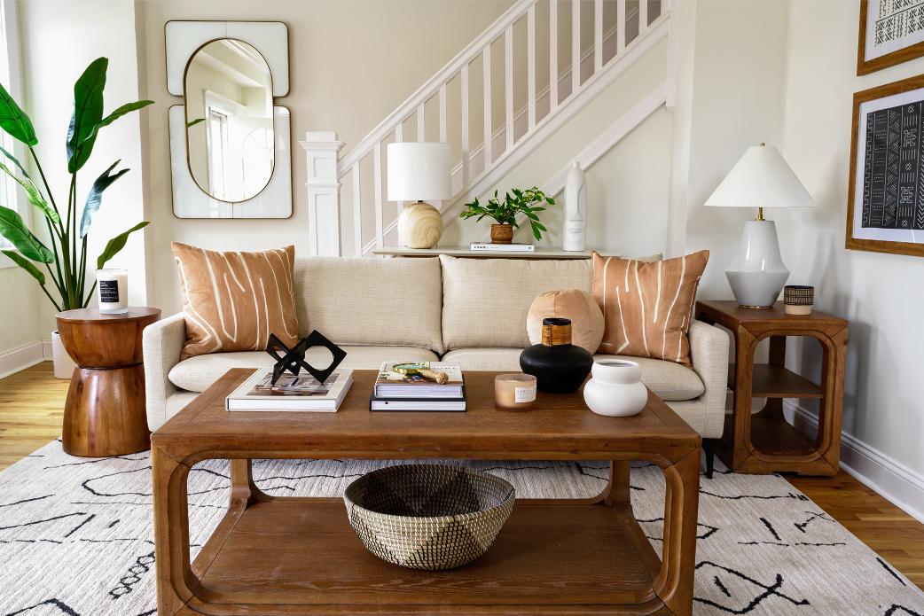
Color scheme for home design. The color scheme is a vital part of your home’s vibe. Colors evoke specific emotions and set particular moods, which is why choosing the right combination is so important for achieving your desired effect. Some palettes are more effective than others in creating distinct atmospheres, so let’s have a look at a few color combinations and how they set the scene for the room.
Understanding the relationship between colors
Before we dive in, it is useful to learn a little more about colors and how they’re combined. Every imaginable color sits somewhere on the color wheel, and where they’re positioned about each other plays a big role in the effects that their combinations produce.
For example, complementary colors are located on opposite sides of the wheel and create strong contrast (think purple and yellow). On the other hand, analogous colors are next to each other on the wheel (such as yellow, yellow-green, and green) and produce balance and harmony. Triadic colors are evenly spaced along the color wheel and create vibrant results (like red, yellow, and blue).
Wonderful color combinations. Now that you have a basic idea of how color combinations work, check out some of our favorites and see which resonate with you:
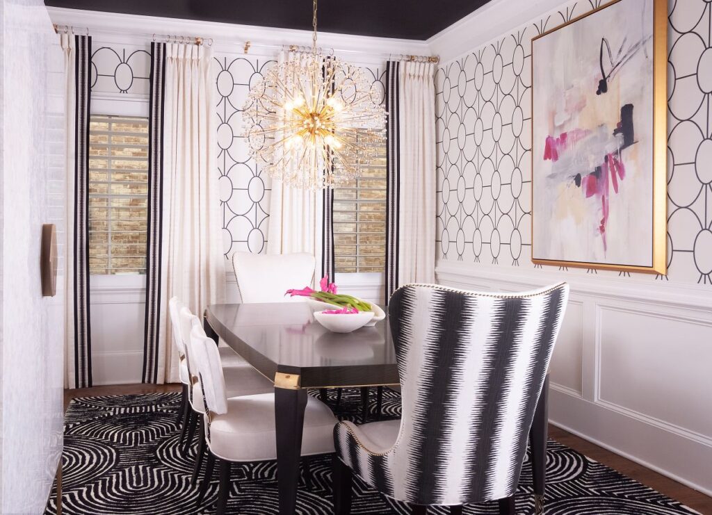
Black and white
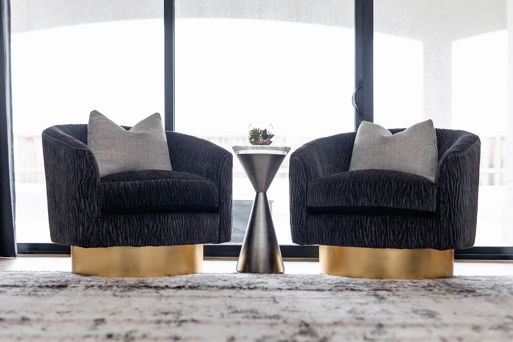
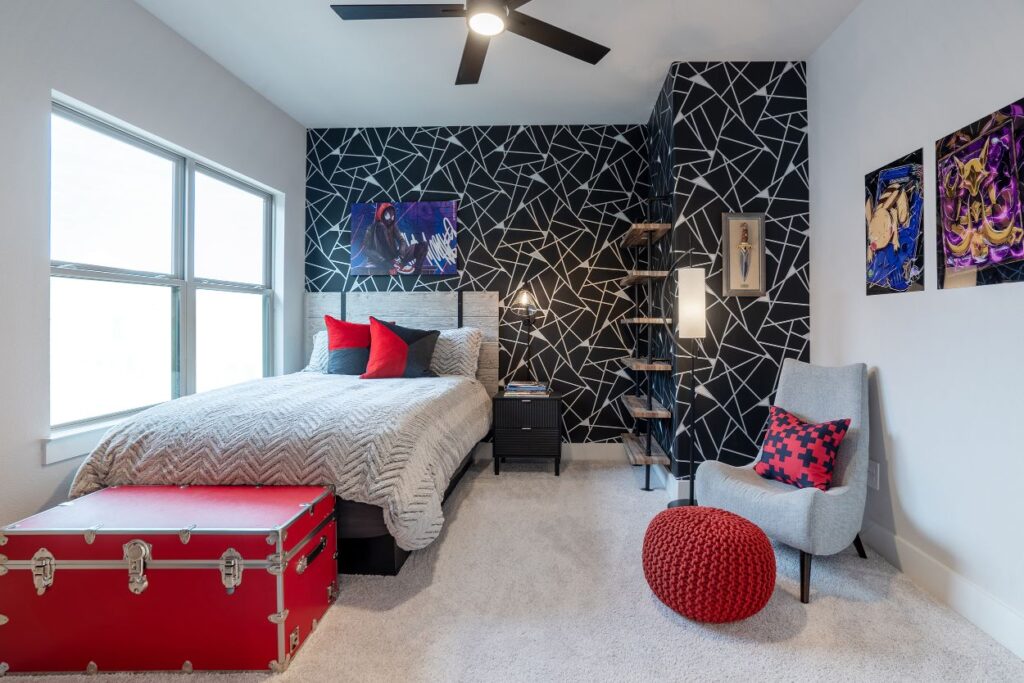
Although these two both technically embody the absence of color, they’re a classic minimalist staple that creates a wonderfully stark contrast. It is a sophisticated pairing that will never go out of style. Pops of color are easy to intermingle and allow for changing up décor without having to reinvent the entire room.
Neutral and blue
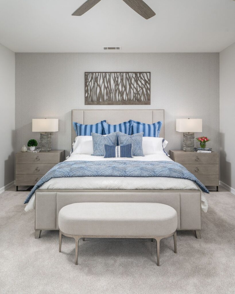
This combination may not make you think of the word “powerful,” but they do evoke an atmosphere that is easy to relax in. Consider adding a touch of gray for balance. A variety of blue shades work with neutrals, but lighter hues contribute to a more beachy or luxurious feel. Alternatively, incorporate an element of black to embrace a more modern feel.
Pink and blue
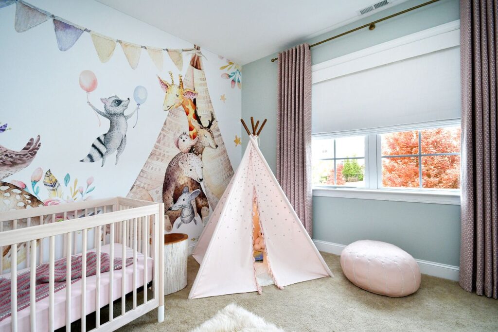
Pink and blue are timeless color pairings for a reason! The color intensities you pick will determine the room’s vibe. For example, brighter and more vivid colors like raspberry or fuchsia and teal or aqua create a fun, lively atmosphere, whereas baby shades in both colors are ideal for children’s rooms and nurseries. The pink and blue color combination will always give your room a youthful look. Use this color combination carefully if you are going for a sophisticated look.
Blue and white
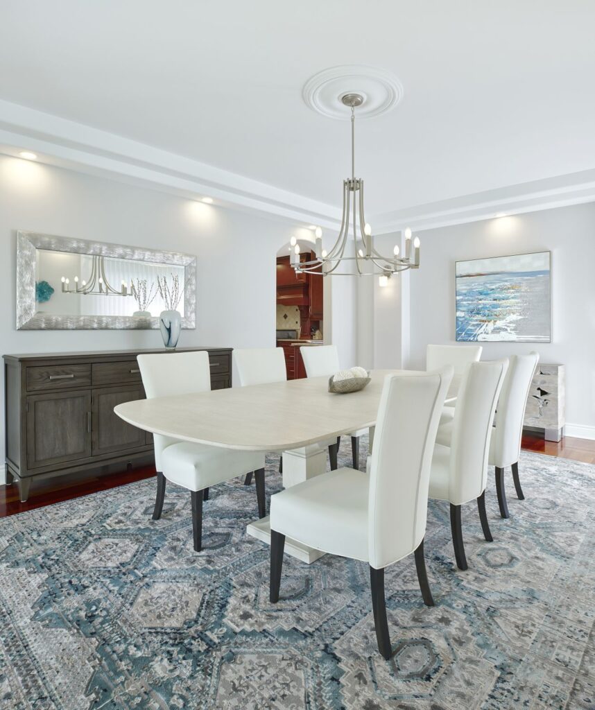
This color combination has been used since the beginning of time – think sky blue and fluffy white clouds! This pairing works especially well with patterns like stripes and florals (think China porcelain and nautical decor). Blue and white color combinations are clean and fresh, and they can easily be combined with other neutral tones to create some depth or soften an area’s overall look.
Green and red
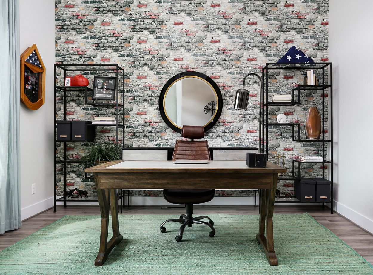
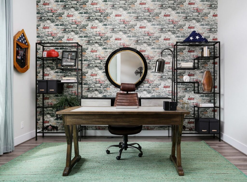
A fresh hue of green combined with a muted brick red produces a rich look without looking like Christmas. This is a wonderful color scheme to use for a vintage aesthetic. Dark green, such as emerald, mixed with a rusty red creates a beautiful clean balance that can be used with any interior design style, from rustic to contemporary.
Black and red
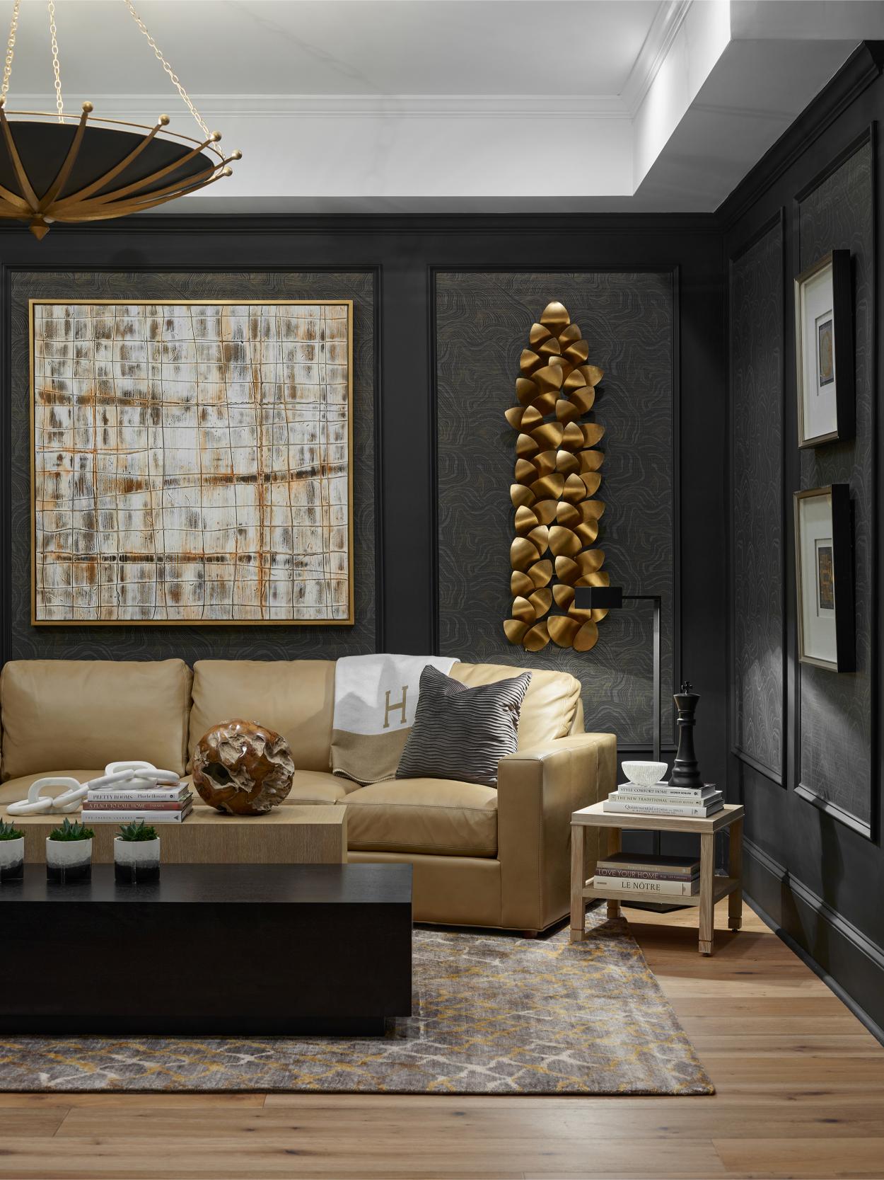
From bugs to birds and fish to snakes, there’s a reason you see this particular color combination so often in nature. It’s wonderfully bold and daring, and it radiates power and strength. Black and red are well-suited to modern and contemporary designs but can also be used more minimally as a color accent in other interior design styles. If you’re not a fan of true red, tangerine or blood orange are suitable, too. If you’re a fan of Pantone’s annual color releases, you may want to try Raspberry Blush by Benjamin Moore. Learn more about this color at our article “How To Incorporate the Colors of 2023 Into Your Home“.
Get bold and try this color scheme for home design.
Dark brown and blush
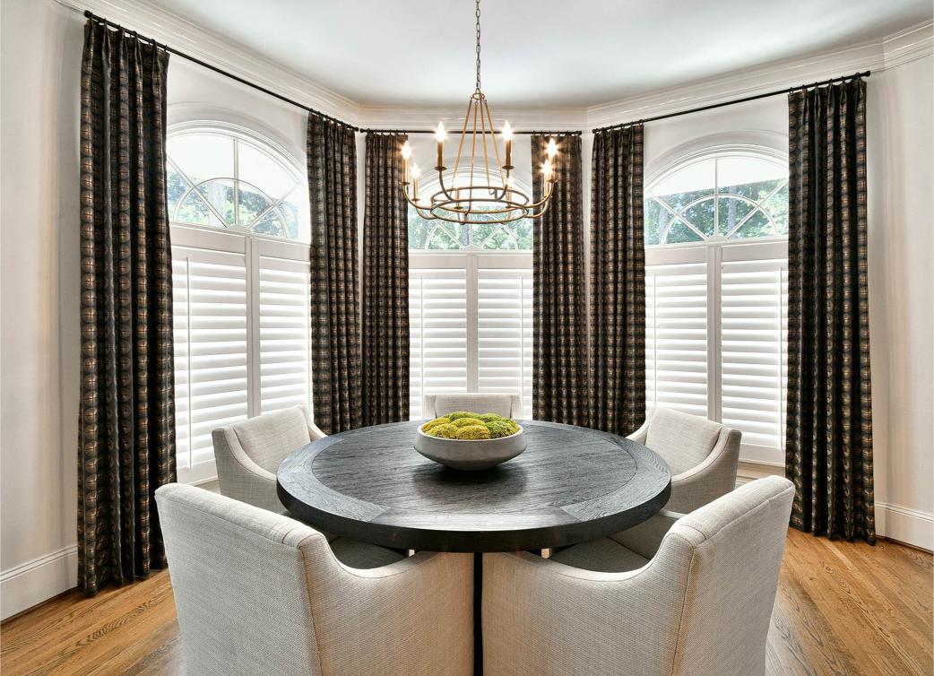
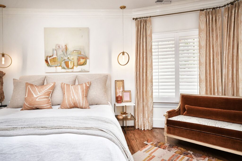
Should you crave the contrast of black and red without its potential harshness, opt for a very dark brown like mahogany and a dusty or rosy pink, or even peach. This blend is very chic, reminiscent of Chanel suits and old-school glamor.
Contact Room Reimagined Design for your Color Scheme Home Design Questions
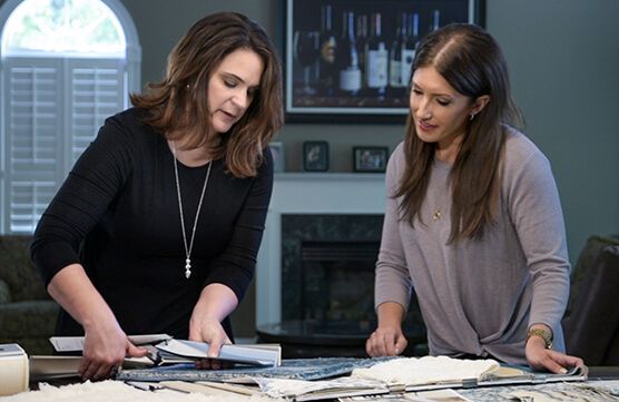
With so many options to choose from, we know it can be difficult to choose one color scheme for a room or home. Even if you do know what type of vibe you want to create, you may be finding it a challenging decision to make! Fortunately, our expert decorators are here to help. Simply contact Room Reimagined Design to help with the selection of color combination(s) to bring your vision to life.

